
Color management for photographers
It might be good to know a little about color management in photographic systems when photographing. Let's start with some basics.
Color space
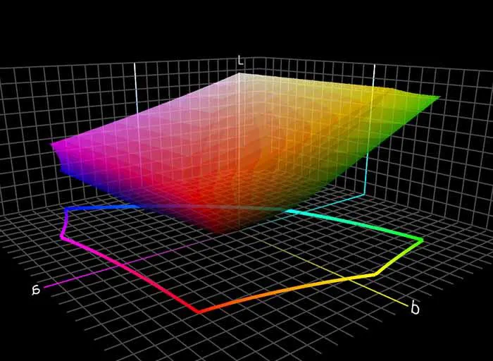
The color space consists of all colors that a given system can register or produce. A color space is a certain range of colors (gamut) which is defined by an ICC profile in a color management system. It can be ICC profiles that describe the colors that a printer, screen or any other apparatus can produce, it can be the colors of a constructed working color space where color data from e.g. digital camera image can be stored pending further processing (many concepts, but I think it will be clear if you read on). Within photography we use two reference color spaces, CIE XYZ and CIELAB or L*a*b*. XYZ is used in all working color spaces and monitor color spaces. L*a*b* is the one we encounter the most, we recognize it from Photoshop and others editing program. L*a*b* is a three-axis coordinate system, L* is the vertical axis going from black to white, a* is the horizontal axis going from cyan-green (minus values) to magenta-red (plus values) where the value 0 is completely neutral in the gray scale. The b* axis goes from blue (minus values) to yellow (plus values). Each color can then be defined within the color space with three coordinates, L*=90, a*=10, b*=0 is e.g. light pink, L*=40, a*=-50, b*=0 is dark blue-green, L*=0, a*=0, b*=0 completely black…
There are different types of color spaces. Anything that can register light, e.g. cameras, scanners, colorimeters, spectrophotometers have their own color spaces. It does not only apply to the digital, also e.g. slide film and color negative film have their own. The color space simply describes which colors can registered and which colors are outside the space, and which of course cannot be viewed/rendered.
This is where it gets a little complicated. All color spaces have different sizes and shapes.
We take an image in the camera's color space and transfer it into our working color space (more on that below) process it while we view it in our screen color space, email it to someone else's screen color space or print it, i.e. send it to a color space defined by a combination of printer, inkset, paper and driver settings. For this to work,we need to have control over the color management all the way from the camera to the finished printout.
Working color space
Working color spaces, such as Adobe RGB (1998), ProPhoto RGB and sRGB, differ from e.g. photo printer color spaces by being very simple. A working color space consistsonly of one maximum value for each red, green and blue, a white point (whatcolor temperature it should have, cool or warm or neutral) and a tone curve that steers from dark to light (often, but not always). a gamma curve).
Their simplicity and the flexibility to define them in many ways make them very good and useful. They are regular and predictable. If you have an RGB value of e.g. 128,128, 128 you can be sure that it is a completely neutral mid gray tone. You can also be sure that the corresponding RGB values in e.g. a printer color space (whichis not a working color space, or at least not should be) is not perfectly neutral gray, it may have a tone of red or green or something else.
The workingcolor spaces differ from each other via different size, shape and tone curves. If you choose a small color space such as sRGB, there is greater risk that colors captured by the camera will end up outside the color space and be rendered (see renderings below) to other similar but less saturated or darker or lighter colors that lie in the color space. If, on the other hand, you choose a large color space such as ProPhoto RGB, you only use a smaller part. This can also sometimes harm the image by causing the available steps to be further apart, and this gets wors as you adjust the image. Depending on the bit depth you save the image in, you have a different number of steps, levels, from the gray scale along the L axis and out to maximum color intensity. If you work in jpeg, that is always 8 bits, i.e. consists of 28 = 256 levels, and then process the image in a large space like ProPhoto RGB, many of the levels will be beyond the color gamut of the image and of no use to you, and consequently we have few levels to work with. Then easily visible stair step effects occur in the image tones (posterization), banding may occur in the sky and so on. If we work in RAW format the images will be in 12-16 bits depending on which camera we have. Most system cameras will produce up to at least 14 bits, 214 = 16,384 levels, and if we work in Photoshop, we can use up to 215 = 32,768. With so many steps we can edit more strongly without encountering any posterization, any effects of quantization error.
Select working colorspace
Choosing an optimal working color space is choosing one that holds all the colors of the image plus some margin for adjustment margin. As small as possible but big enough. At the same time, if you want to make large adjustments to the image, you need more space in a larger color space. Then it will be sparser between levels with the risk of the tonal scale collapsing and ugly posterization (banding) occurring. Often Adobe RGB is recommended as a standard, but it is far from always the ideal color space. In nature photography, for example, part of nature's yellow-green, warm red, yellow and orange tones ends up outside the color space. Yes, it can be tricky to choose working color space. Turn on the highlight and shadow clipping indicators in the RAW format manager and continue to keep track off ‘out of gamuts’ as you continue to work on the image.
As long as we keep the image gamut within the color space, we can adjust and change without losing so much in detail, if the colors are packed together at the outer border of the color space it's not much to do. Admittedly, in the end we will have to fit the image into a color space that in most areas is smaller when we are going to print it or publish it on the web, but then we can do it in a controlled way and only once. More on that later.
The gamma curve determines what the tone curve looks like. Near black, a color space with a low gamma, like 1.8 for ProPhoto RGB, lightens faster than in a space with higher gamma, such as 2.2 in Adobe RGB. Near white it is the opposite. So, the gamma curve is important because it affects how we can adjust especially the dark parts of the image. In the shadows it is good to have a tone curve that places many useful RGB levels in the dark parts in order to be able to change contrast without the tone curve breaking down into visible steps.
If you want maximum headroom for adjustments in your images, you can also skip sRGB and Adobe RGB. These color spaces were never even intended for digital cameras and fit quite badly for the purpose. . Joseph Holmes has constructed color spaces entirely based on the ways digital cameras render the colors in the world around us (https://www.josephholmes.com/profiles/about-my-profiles).His DCam color spaces are available in 5 sizes so you can adapt them to all images regardless of color range without them having to be either too small or too large. The tone curves are also better adjusted to the human eye than the usual gamma curves 2.2 and 1.8. Each of the DCam spaces is available with a set of 29 “chroma variants” which are lookup table type profiles. These special profiles can be assigned to the image to selectively adjust the chroma (similar to saturation but with less effect on lightness) of the image upward or downward, with zero clipping of image colors because each chroma variant’s gamut volume is different from all the other profiles. A visit to his website is fun and useful if you want to check the quality of your image adjustment (www.josephholmes.com).
Printer color spaces
When we enter the printer world, the basic colors are no longer RGB. Now the additive primaries R, G and B are replaced by the subtractive primaries Cyan, Magenta and Yellow. Cyan absorbs Red, Magenta absorbs Green and Yellow absorbs Blue. Thus these three ink classes modulate R, G and B light reflecting off of a printed sheet. Black ink, abbreviated as K, is used to achieve a blacker black than would otherwise be possible. Thus we speak of CMYK, but many printers add more inks such as light Cyan, light Magenta, gray,etc.
When making printed images we start with white being defined by the color of the paper and, with inks, subtract various portions of the red, green and blue thirds of the visible spectrum.
The science of ink mixing for printing, whether on a printing press, with an inkjet printer or with any of the many other approaches to making a color print, is very complex and is done in a great many ways. For example, the black ink which is used in most printing systems can be used on many ways and extra ink colorslike orange, green, violet, red and blue can be used to expand the printable gamut.
The printer colorspaces have a completely different form than the working color spaces because they are based on CMYK and not RGB. In addition, they are usually significantly smaller.
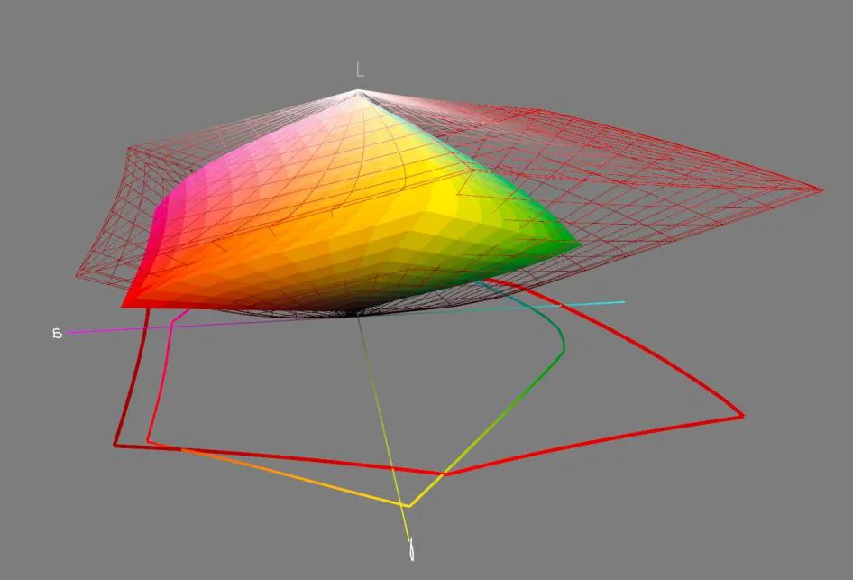
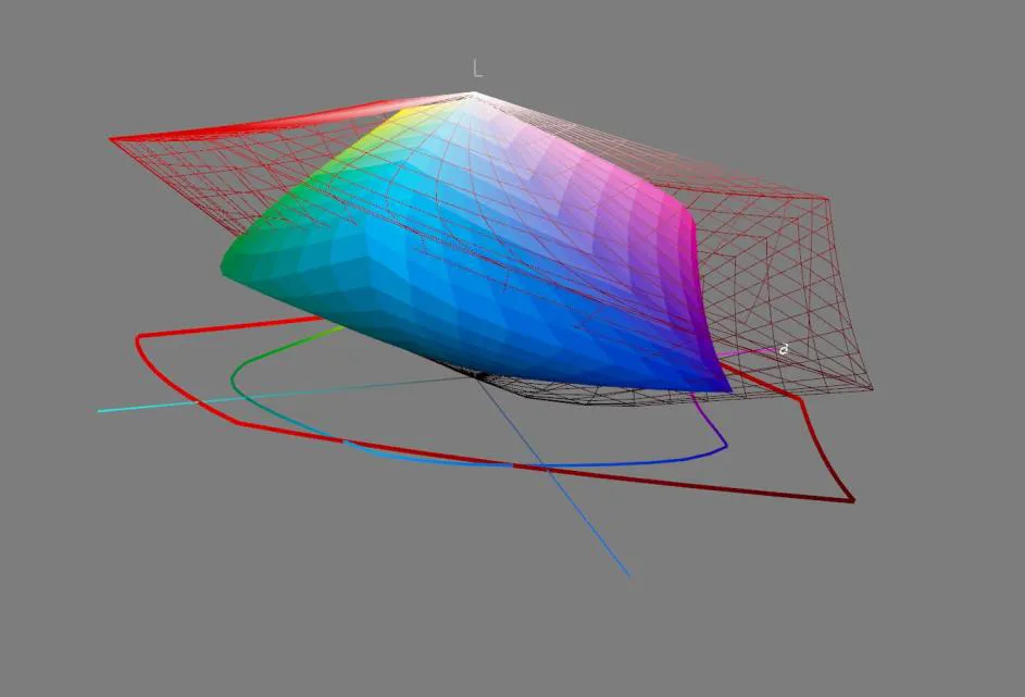
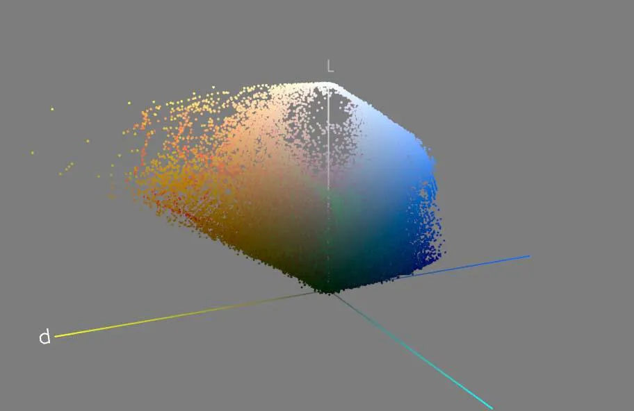
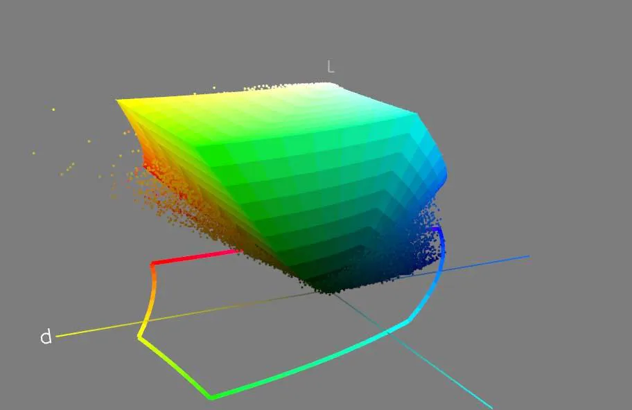
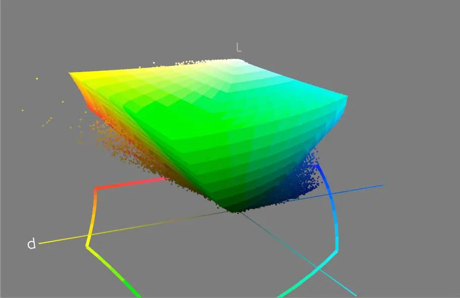
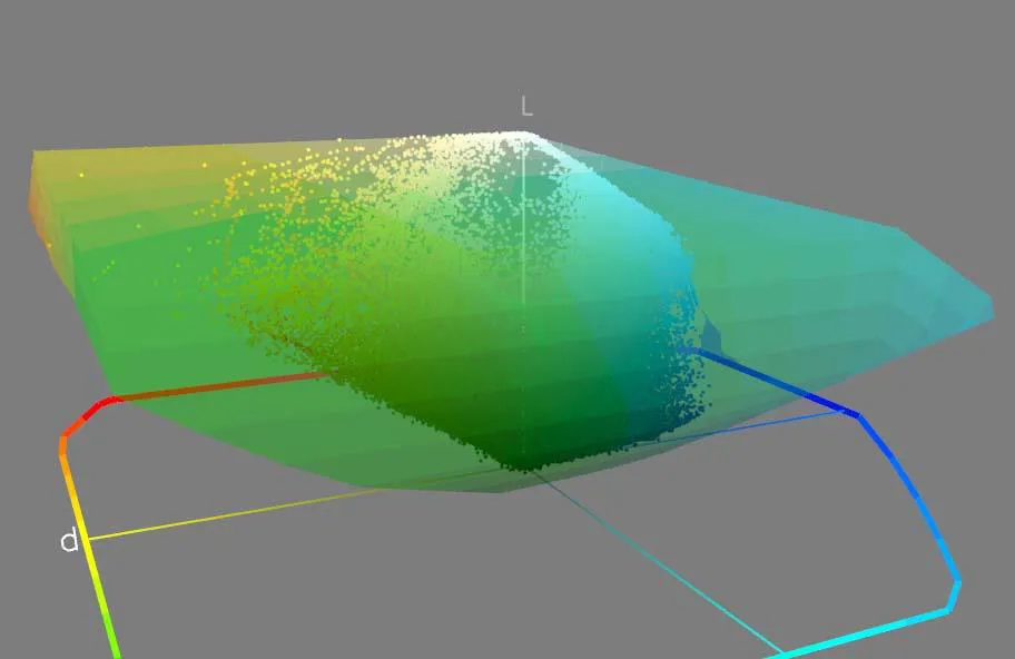
In the comparison between Adobe RGB and my Canon 4100 printer in combination with Hahnemhule paper PhotoRag Baryta you can clearly see that the printer color space is significantly smaller than Adobe RGB. But it also has a different shape, and many yellow, red, cyan tones that can reproduced on a print will be excluded because Adobe RGB has already clipped them.
ICC profiles
ICC profiles are what makes it possible to move images between different color spaces and still keep the colors as similar as possible. An ICC profile tells you what RGB values a particular color in one color space has in another color space. Different RGB values but the same color. A kind of phrasebook so the color spaces talk about the same thing even though the languages differ.
When you convert from your working color space to e.g. your printer color space, the image's
and the printer's color coordinates are compared in a common color world, the Profile
Connection Space, PCS. There, the program (Color Management Module, CMM, color engine) can see what RGB color in the working color space corresponds to what RGB color in the printer color space. Let’s look at a real example, I have an image in ProPhoto RGB and want to print it with my Canon 4100 on Hahnemhule Museum Etching. A certain green color have the RGB values 69, 85, 85 I Prophoto RGB space, the ICC-profile take care of it and sends the RGB-values 65, 126, 95 to the printer and almost exactly the same color appears on the print.
ICC profiles can often be downloaded from paper manufacturers' websites. Generally, they work good, although you can sometimes achieve better results with your own profiles produced with the actual printer. You need one profile for each paper/printer combination.
I produce all my profiles using an i1 iSis 2 XL. It is a good machine that has a precision and repeatability that cannot be achieved with simpler handheld instruments. To produce good ICC-profiles you need to be very thorough and precise, and good equipment helps. One of the advantages of creating your own profiles is that you can use more colors on the testcharts and increase the size of the color patches to get better measurement precision. You can influence the perceptual rendering and how it prioritizes neutrality, saturation and much more.
To print with ICC profiles, you must have a printer where you can switch off the printer's own built-in color management. It can be done on all ambitious photo printers, but not always on simpler office machines and simple photo printers. If you don't turn off the color management then it will happen 2 times and then it usually goes to h-e.
How do you create an ICC profile?
Creating an ICC profile for your monitor is a simple procedure. You use a colorimeter or spectrophotometer and measure the screen in a program. Colorimeters are pretty light investment in the context and work great for screen profiling. Make sure the screen is at working temperature, clean and correctly calibrated when profiling.
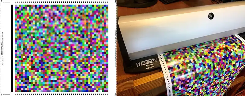
Creating profiles for printers is more complicated and requires more expensive profile software and equipment. You start by making sure the printer is in tip-top shape. Some printers such as e.g. Canon's large-format machines have the possibility to adjust ink quantities, it allows you to finetune the printer before you make the ICC-profile. When you know which paper setting and which amount of ink works best, it’s time to print a testchart of maybe 1500-2000 color patches. You print it without color management so the RGB values goes directly into the printer.
When the testchart has dried properly (better to wait too long than to be in a hurry) you measure the patches with a spectrophotometer. The spectrophotometer measures LAB values for each patch so we know what color you get from a certain RGB combination in the printer. Then you feed the measurements into a profile program that can calculate the ICC profile. The program now knows which LAB color actually resulted from a certain RGB combination, so if we want to produce that actual color in the future, it is those RGB values we should feed to the printer. LAB colors are, as we remember real defined colors that everyone (standard viewers) agrees on. We've got a translation key that tells us what RGB numbers we should feed the printer if we want a certain color. And we’ve got a reference in LAB that can be used by other profiles when we want to take the image further to monitors, other printers, etc. It's pretty genius!
Further with ICC profiles
Once we have ICC profiles for printer/paper combinations, monitors, scanners, cameras etc., they all have a common reference in LAB (screens and working color spaces are indeed in CIE XYZ but they are translated to LAB in the conversion), all will be able to talk to each other and mean the same color.
Many ICC profiles, e.g. printer profiles and display profiles work both ways. It is one useful property that allows us e.g. to, on the monitor, simulate how the colors will be on a printout. We can make a Soft Proof. Soft proofing is easy to do in Photoshop or Lightroom (haven't used Lightroom myself, but it's said to be easy). What can be difficult and requires some training is to interpret the soft proof. Even though the screen shows the correct colors (within the screen's limitations) it's a completely different thing to look at a screen with emitting light versus looking at reflected light from a print. Especially if you soft proof a print on matte paper, which always has much less black than the screen. It may look like a disaster, but it is important to calm down and interpret the image in the right way. It will show you where the problems are, and you have a chance to fix some of them with image adjustments before printing. The same applies if you are going to send the files to a printing press, especially with very dark pictures. Then we end up in the CMYK world and may have to convert the image to CMYK before we send it off to the printer. Often, though, the presspeople prefer to do the CMYK conversion themselves from RGB. They may have different presses, each one with its own profile. Then it’s up to them to do a good job and for us to worry.
You can also make Hard Proofs. This means that we print on our own printer in such a way it imitates another printer or printing press. However, I have not come to really agree with that technique, it matters so much what the properties of the paper are for how you experience the image, and it is difficult to find a print paper that feels like one newsprint or book paper. Someone else might succeed, I'll stick to the screen.
What happens to the colors that do not fit in the color space?
As we have seen in the illustrations above, there is a big difference in the size of the color spaces and when it comes to printing, you end up with a small color space. What happens to the colors outside the color space?
The profiles always come in four variants (renderings) with four different strategies to manage colors outside the color space. We find them in the print programs, and we can find them when we want to convert files in e.g. Photoshop.
Perceptual
Perceptual rendering means that outside colors are moved into the color space, and at the same time all other colors within the color space are adjusted so that the luminant relationship of the colors is reasonably maintained. This means that detail in saturated parts is retained, but the image can be perceived as a bit faddish, too little overall color saturation. The white point, i.e. where the RGB input is 255, 255, 255, is moved to the white point of the target color space, e.g. the paper white in a printer profile. At input 255,255,255 should no ink ends up on the paper, so the paper itself becomes a color in the image. All other colors are adjusted so that the whole picture gets a warmer tone when we write on a warm white paper and a cooler tone when we write on a bluer paper. Perceptual rendering can be 'safe', it becomes quite good most of the time. But it can often be better with other renderings.
Saturation
Saturation is a rendering very similar to perceptual, but it prioritizes saturation and strives to maintain saturated colors. If you feel that perceptual gives a little faded feeling, it might be worth trying saturation (an alternative is, of course, to use perceptual profile that prioritized color saturation in the perceptual rendering). White point works as with perceptual rendering.
Relative colorimetric
Relative colorimetric is a rendering that, in the same way as the two above, adjusts the white point to the target, but which otherwise strives to keep the colors as they are. Colors outside the color space (out of gamut colors) is moved to the outer limit of the color space. This means that prints will be colorful and pleasant. But if we have an image where many of the colors are far outside the color space they will be packed together at the outer boundary of the space and thus losing detail in reproduction.
Absolute colorimetric
At some point I have chosen to print with absolute colorimetric rendering. Some time I have experienced skin tones better rendered with absolute colorimetric. But that is an exception. Otherwise, absolute colorimetric is mostly used for making 'hard proofs' or for evaluating profiles, testing how they behave in relation to how they should behave. Absolute colorimetric strives to keep the colors exactly as they are. This means that also the white point is retained from the source color space. If you then print on a paper that has a different white point than the source, the printer will also give the white on the paper a color tone. A white frame around the image, for example, gets a color tone that matches the whiteness of the source color space. Absolutely colorimetric also has no black point compensation.
Black point compensation
The black point compensation is available in all renderings except absolute colorimetric (although the one in perceptual rendering is meaningless since the black point compensation already is embedded in the profile). It makes the blackest black in the source color space moved to the blackest possible in the target color space (e.g. from the absolute black in working color space to the not so black in the printer/paper color space) . If you print on a matte paper without the black point compensation active, the effect becomes dramatic because matte paper has a maximum blackness of perhaps L*=17, while the source color space has 0. Then all tones darker than L*=17 will be completely black with no details in the image. Most of the time it is best to have black point compensation checked (only in rare cases, with certain profiles, there may be problems with the perceptual rendering. So if you want to be 100% safe you can uncheck the black point compensation for all perceptual rendering).
When using relative colorimetric rendering, one may be concerned about how the black point compensation compresses the dark areas. Then it might be better to print without compensation and instead adjust a copy of the image before printing.
The Dark Side
In conclusion, we must talk a little more about the dark side. It is often difficult to master. If we lived in a perfect world, tone curves in camera sensors, scanners, printers, papers, would match our eyes, and there would be no problem at all to produce fantastic pictures. Unfortunately, that is not the case. First, at least in high-contrast motifs, tones must shrink together to fit on a monitor and even more to fit on a paper. Secondly, the camera's sensor sees the world in a completely different way than we do. If we could see the unedited tone curve coming out of the camera, we would see a very dark image, not at all like the reality.
Even before we see the first version of the picture on the screen, it has been baked around with tone curves and colors. Some information in the camera's 12-, 14- or 16-bit image may have been lost on the road. Then we place the image into a working color space that can remove further information, especially in the dark parts of the image. That's why it can be so difficult to get detailed shadows no matter how you adjust in Photoshop. If you work directly in RAW or in Lightroom, the situation is somewhat better, because here the program works directly with the original image as the camera recorded it, and you don’t lose so much information.
To bring colors and tones from the camera all the way to the finished print, it is important every step of the process is carefully considered. It starts with the exposure. It strikes me that to get optimal results, you do the opposite of how you did with film-era negatives. Before, we exposed for the shadows and developed for the highlights to get printable negatives with tones all the way. Now in the digital world we expose for the highlights and develop for the shadows for the same reason. In the bright parts of the picture, we have many levels to work with. We only have to ensure that the sensor does not become oversaturated. "Expose to the right", this means that we lift up the shadows as far as it goes in the tone curve, without oversaturating the highlights, in order to get more levels to work with in the shadows (not bad to take some alternate exposures if the subject is still, nowadays we don't have to pay for the film) It's always easier to make one image darker with good results than trying to get contrast in the shadows without having enough levels to work with. Thus, 'Expose to the right'.
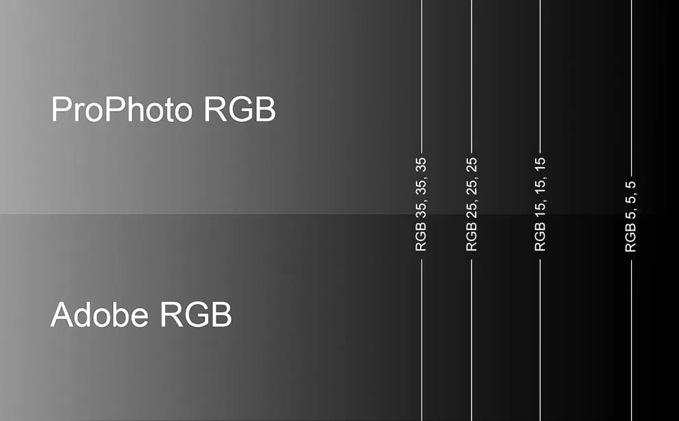
After we adjusted tone curves and white balance as far as we could in the RAW format converter it's time to place the image in a suitable working color space. As we see in the illustrations fig.11 (look at them on a screen, on regular office paper printouts it is not sure that you can see clearly) in Adobe RGB there is almost no tones to be seen in the shadow parts and makes them difficult to adjust with increased contrast, this is because the gamma curve flattens out markedly in them darkest parts. A working color space such as DCam3 has a better tonal distribution over the entire curve and opens up the shadow parts significantly.

At last
For us photographers, color management is about getting all the world's colors down on a piece of paper. If we do it in a controlled and good way, we can actually experience true colors in the photo, although we know that the colors of reality most of the time has been compressed, then it is good color management.
Sometimes it goes, however, not so well. I now and then photograph my wife Ingrids watercolors to produce limited printed editions. Ingrid is even pickier with colors than I am and there was some heated argumentation when we were working on a picture without managing to get the colors right. It was a special blue color, Preussian blue, completely impossible to manage, it pulled away and became something completely different. Finally, I went down to the studio and opened the jar of Preussian blue dry pigment and looked down, it was like looking down into infinity, into the universe’s ultimate limit. I was completely fascinated! Realized that we can never do this with my poor Canon printer. Nowadays, Ingrid avoids Preussian blue in paintings we are going to make print editions of, and we are bestfriends again. But I go down every now and then and look down into the jar, can't help it.
I have tried with this little essay to describe the basics of color management for photographers and hope it can be of some use. Finally, I want to say a big THANK YOU to my new Californian friend Joseph Holmes, who read and fact checked the text. If it remains any inaccuracies, it is entirely my fault.
Odensbacken oktober 2024
Jan Lindahl
© Jan Lindahl 2024